Analytics
The Analytics page provides insights into the performance and
activity of sensors, specifically how they receive and process
incoming data from the field.
It includes multiple sections for monitoring
sensor efficiency and drone detection patterns:
- Processing Time
- Sensor Diff
- Drones with Pilot/Home
- Drones with DJI Multicopter
- Drones Per Asset
- Users can zoom in/out using the mouse scroll function.
- Users can toggle individual data lines by clicking on items in the legend, allowing for custom visualization of datasets.
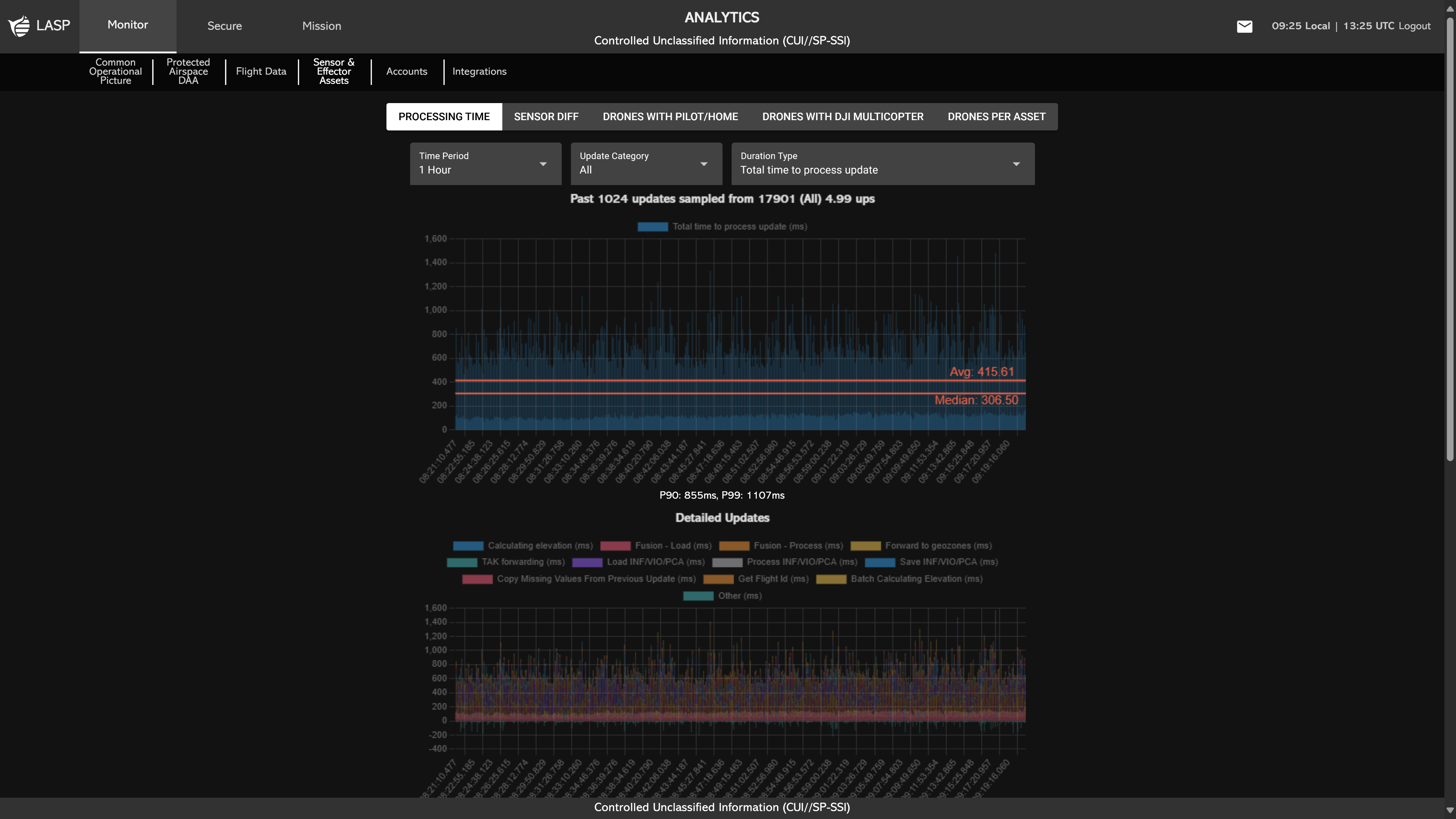
When the Analytics page is accessed, users begin in the
Processing Time section. This section presents graphs that
illustrate how long updates take to process and how many
aircraft are handled per update.
Displayed Graphs Include:
- Past Sensor Updates Sampled – Shows duration types over selected time periods.
- Detailed Updates – Tracks how long various processes take (e.g., elevation calculation, flight ID retrieval).
- Aircraft Per Update – Displays the number of aircraft processed in each update over time.
- Median Crewed Processing Speed vs Number of Aircraft – Compares recent and past data based on aircraft count.
Users can adjust the data displayed in the graphs using the following parameters:
- Time Period – Choose between 1, 3, 6, 12, or 24 hours.
- Update Category – Select the type of update to analyze: All, Crewed, Drone, Line of Bearing, Radar, or Ship.
- Duration Type – Switch between Total Time to Process Update and Time Per Aircraft.
Sensor Diff is defined as the difference between the timestamp
reported by the sensor for an update and the time at which the
UNIFY.C2 backend received and began processing that update.
This metric helps assess data latency and transmission
performance across environments.
This section allows
users to select an asset from a dropdown and visualize the
Sensor Diff Over Time graph, which includes:
- Sandbox Sensor Diff (seconds)
- Production Sensor Diff (seconds)
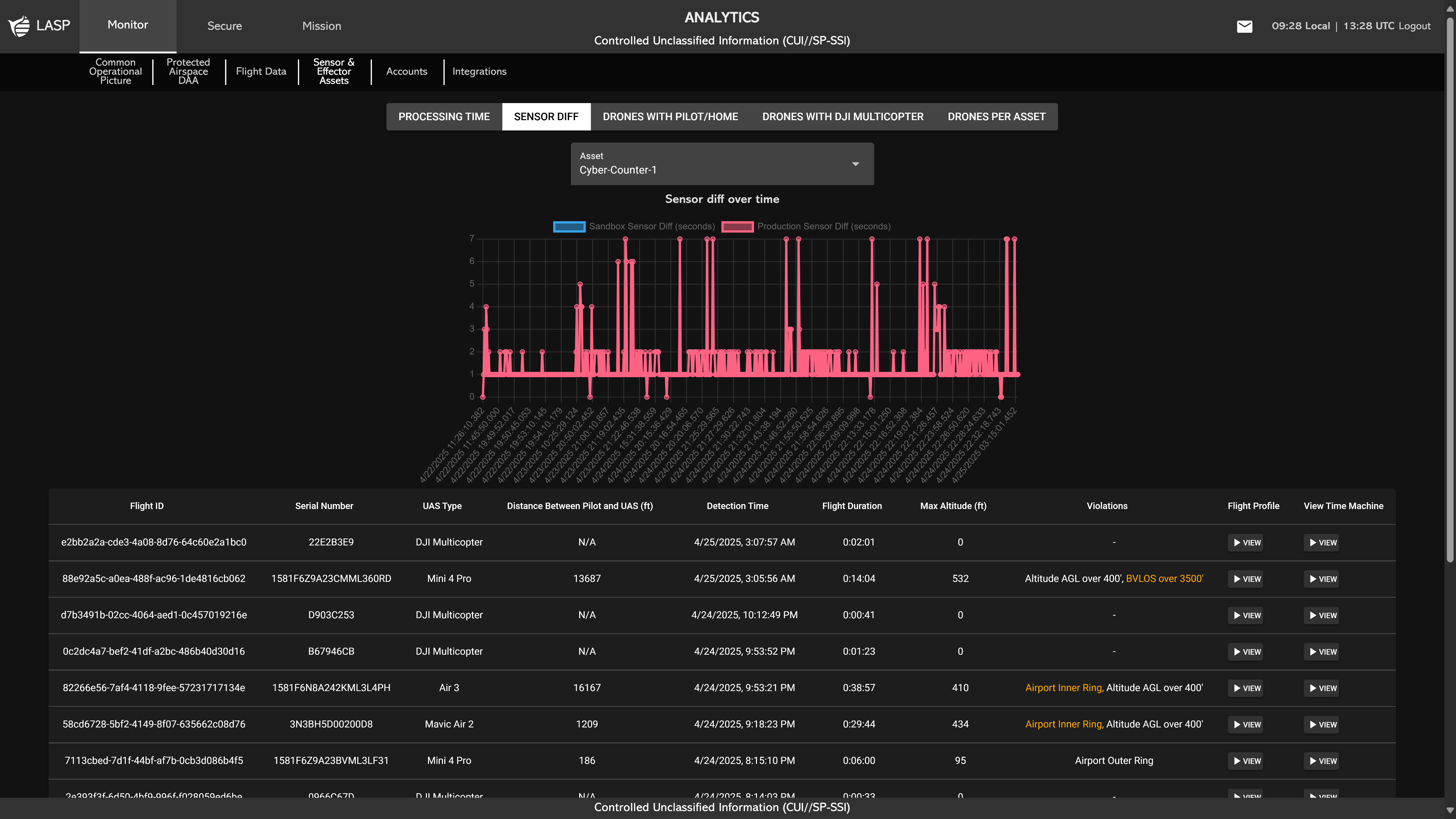
Beneath the graph, users will find a Flight History-style
table that lists flight logs captured by the selected asset.
This table includes key fields such as:
The table layout is consistent with the Flight
History section (see more on Flight History), enabling users to quickly identify, review, and
analyze relevant flight activity associated with sensor
performance over time.
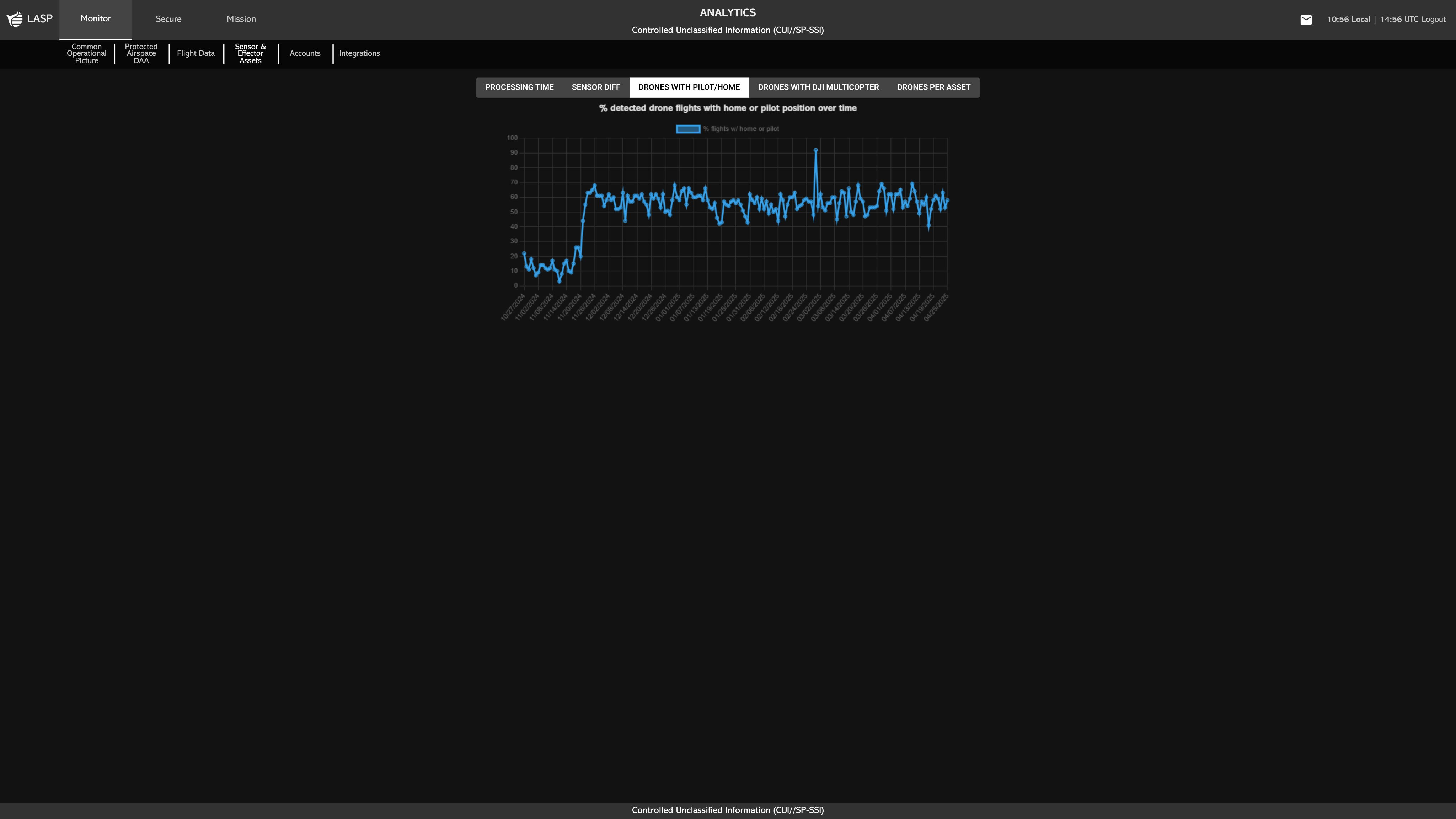
The Drones With Pilot/Home section displays the percentage of detected drone flights that include either a home position or pilot position over time. This metric helps users assess how frequently location-based metadata is captured during detections, providing insight into sensor effectiveness and flight transparency.
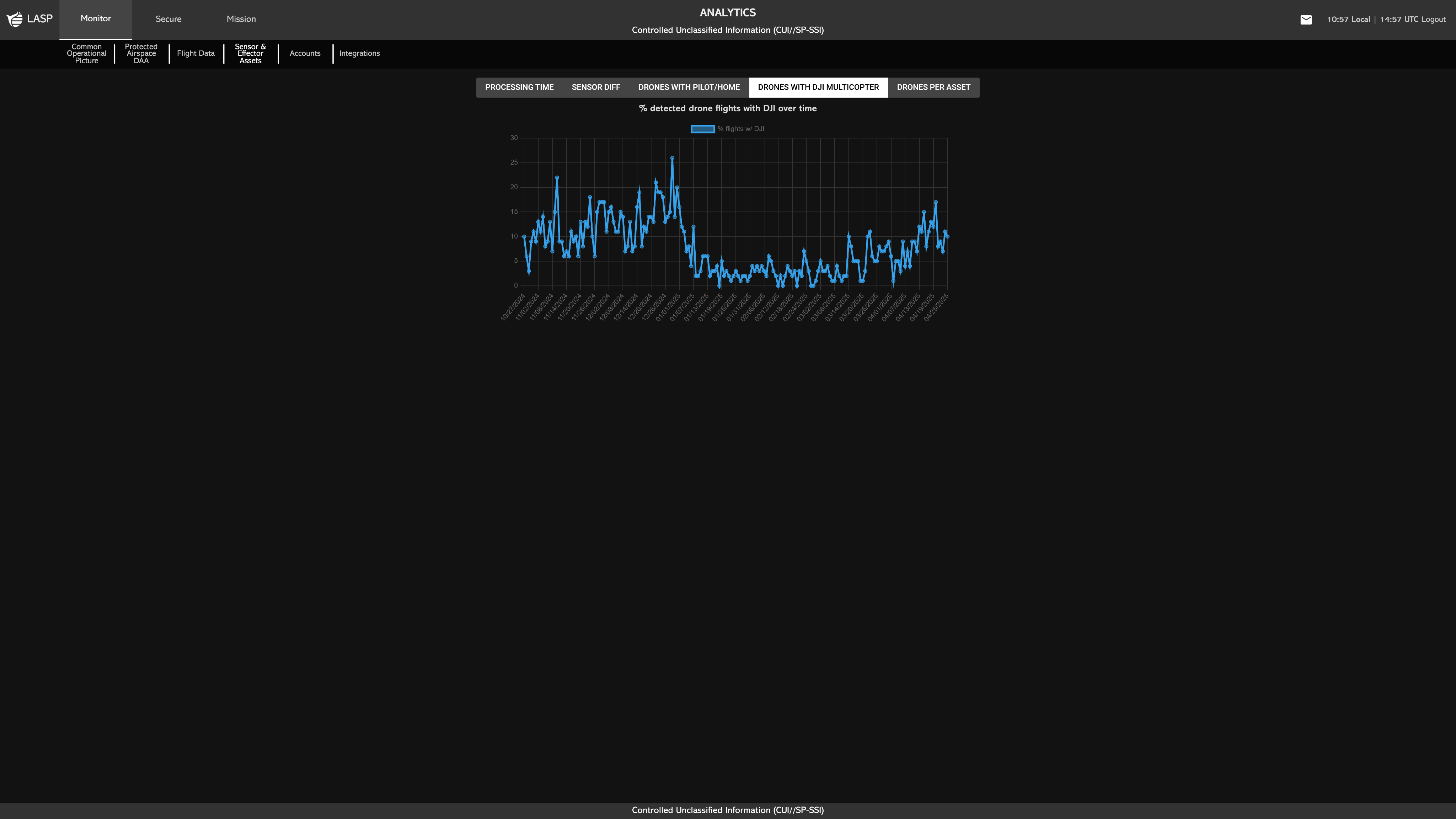
The Drones With DJI Multicopter section displays the percentage of detected drone flights identified as DJI multicopters over time. This provides visibility into the prevalence of DJI-manufactured drones within detected activity, offering insights into manufacturer trends and potential operational risks.
Note:
A high percentage in this metric may indicate that
UNIFY.C2 is unable to accurately determine the type of
many detected drones, defaulting to DJI as a fallback
classification. This could suggest:
A low percentage is typically a positive indicator,
meaning the system is correctly identifying a broader
variety of drone types, improving situational clarity
and threat assessment.
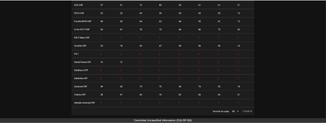
The Drones Per Asset section displays the number of
drones detected per asset over a selected time range.
Users can customize the view using two dropdowns:
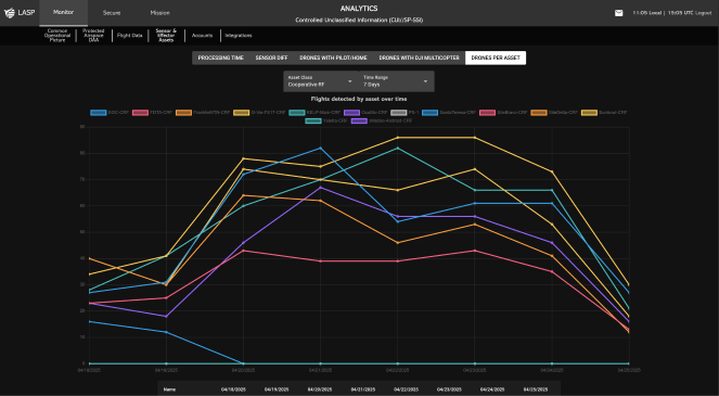
A line graph is shown at the top of the section, where each line represents an individual asset. This visualizes how drone detections fluctuate over time for each asset.
Below the graph is a detailed table that breaks down the
detection counts per day. The table includes: